Orchid
$450

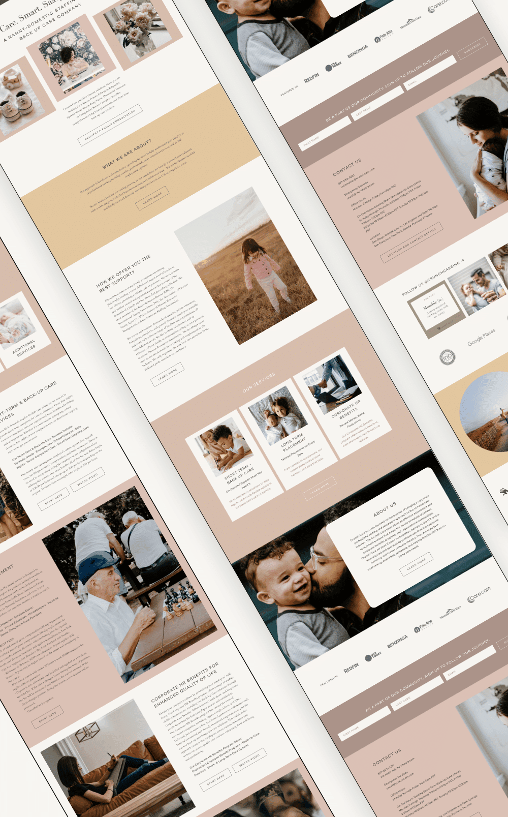
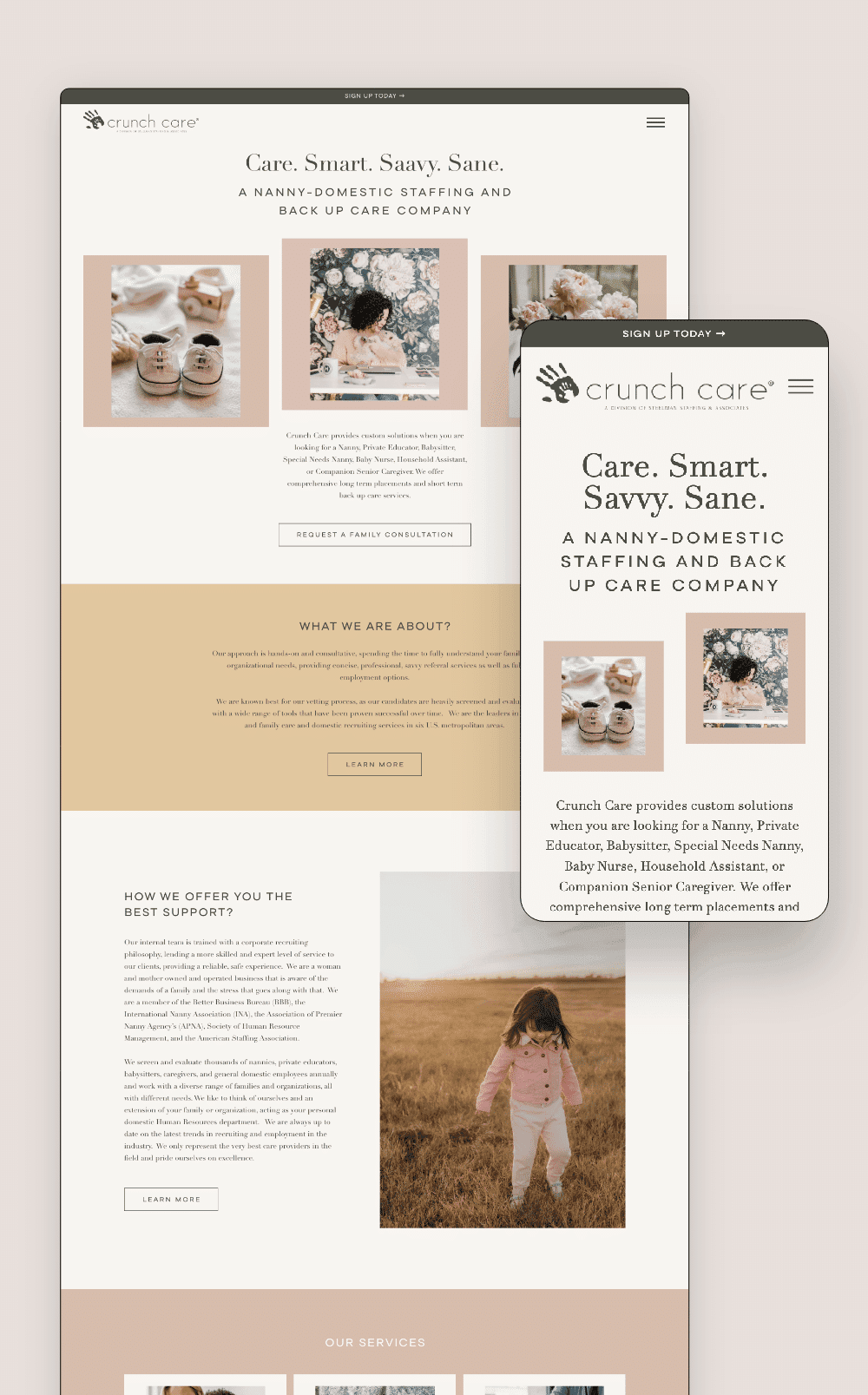
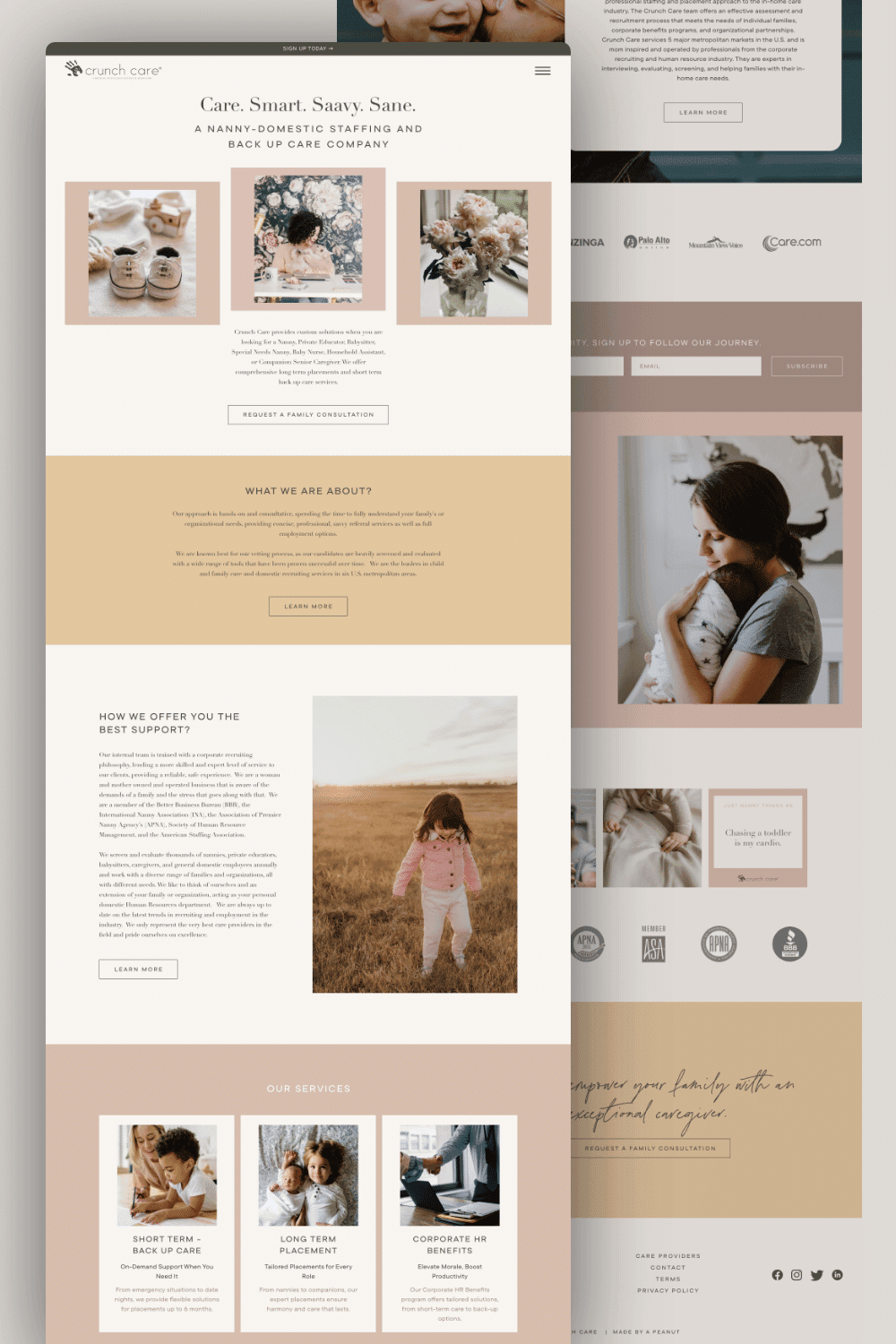
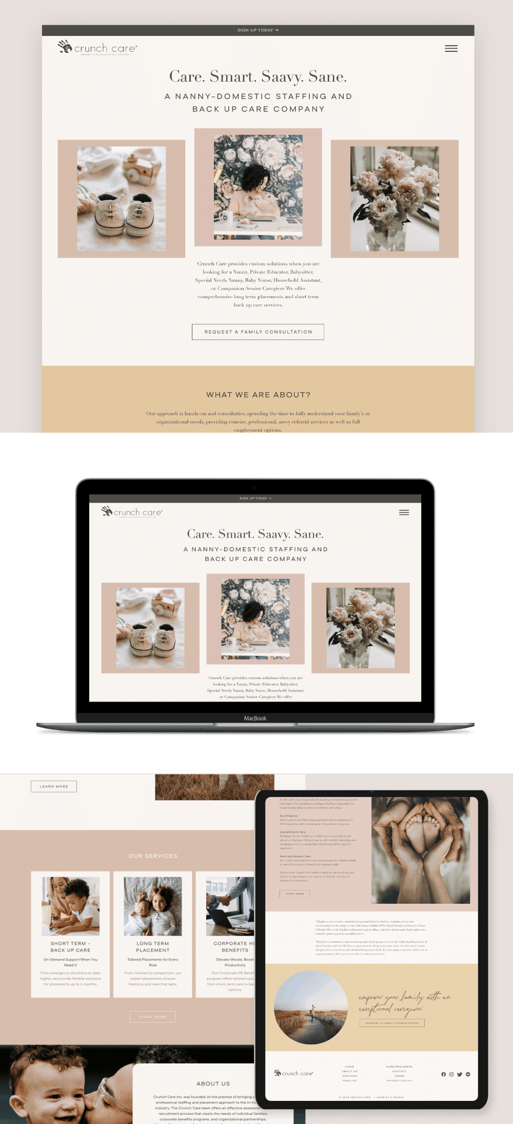
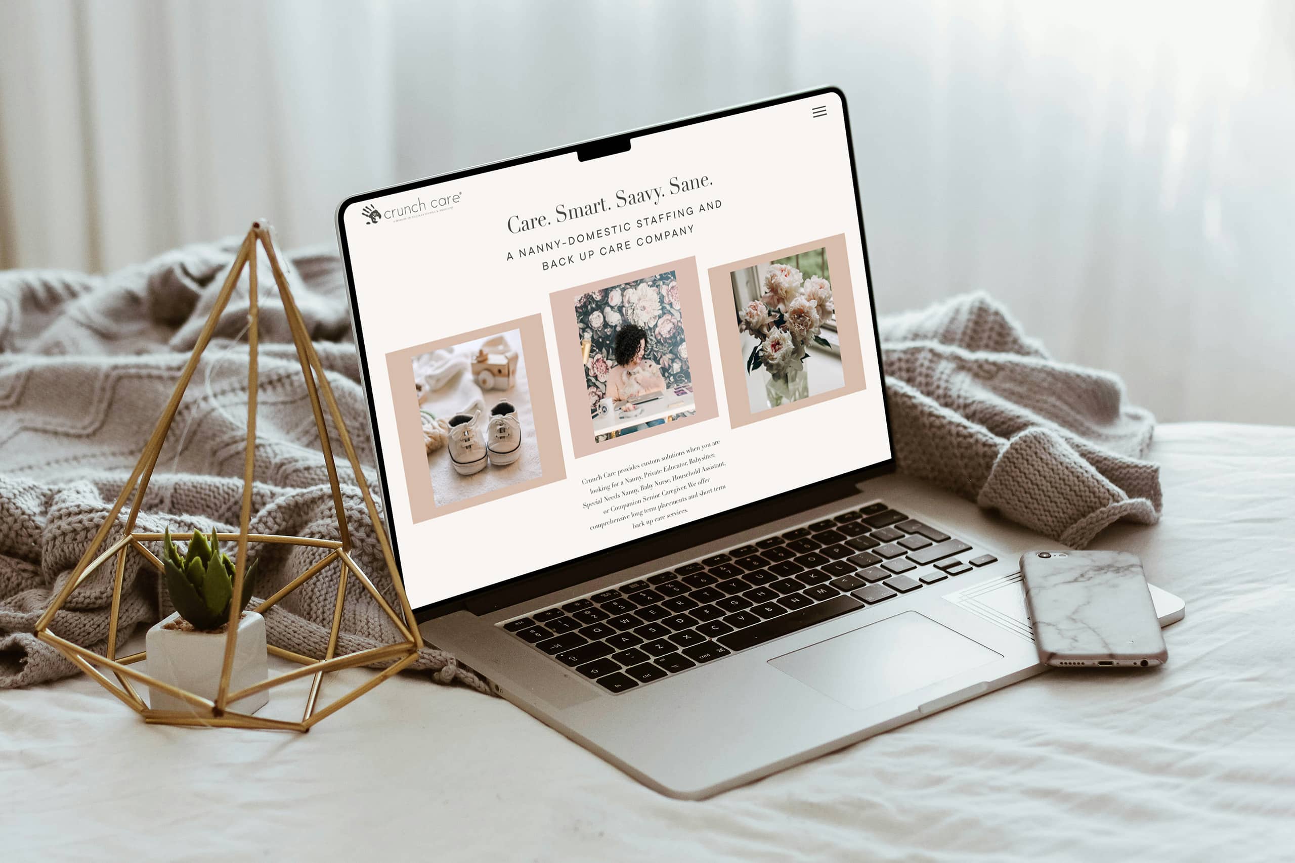
For the established agency owner with a wide service offering, a specific aesthetic vision, and a client relationship that goes back years — this one’s for her.
If you’re running an agency that does more than one thing, you know the website problem. How do you show everything without overwhelming the person who just landed on your page looking for one specific thing? Crunch Care offers backup care, long-term placements, staff nannies, and senior care. Getting all of that to feel calm and navigable — not chaotic — was the whole challenge. And doing it for a client who knew exactly what she wanted made it even more interesting.
Crunch Care came to us with a site that had run its course. It was outdated, had technical issues piling up, and just wasn’t representing the level of professionalism the agency had grown into.
The goal wasn’t just to fix what was broken — it was to rebuild it in a way that actually matched where they were now. A modern, polished site that could hold their full range of services without feeling cluttered, load and function reliably, and give families the kind of first impression that makes them want to reach out.
We came in with a solution that did all of that and then some.
The technical side was straightforward for us — slow load times, a custom theme that made even simple edits a headache. We rebuilt it clean inside our ecosystem and that part went smoothly.
The real challenge was the vision.
Our client knew exactly what she wanted. She’d been living with inspiration references, had a specific aesthetic in mind, and needed us to land on that feeling without copying anything directly. Translating that to the team took extra care, so I stayed hands-on throughout the whole process.
And honestly? The first version wasn’t it. She was disappointed with the front page and asked if we could get on a call and go through every section together. That’s the kind of feedback that stings a little — but it’s also the kind that means the client cares, and caring clients push you to do your best work. We got on that call, went section by section, refined the layout and imagery, and kept going until it clicked.
It clicked.
When an agency offers four different services, the instinct is to lead with all of them. We did the opposite.
The top of the site is calm. One headline, one entry point. The full menu is there when you need it — it just doesn’t rush you. People can ease in, figure out where they are, and go deeper when they’re ready. Every section has a clear job. Services are grouped visually so you can scan without having to read everything. The trust signals — press features, credentials, about section — show up after you already understand what Crunch Care does. By the time someone gets there, they’re ready to receive it.
The visual system was built from the ground up. Her previous brand colors weren’t doing her any favors — the site felt dated and inconsistent, and it wasn’t matching the caliber of agency she’d become. We started fresh, developed a warm neutral palette that felt elevated and modern, and built a visual language that actually matched her aesthetic vision. Logo, colors, photography direction, spacing — all of it cohesive and intentional for the first time.
When everything feels like it belongs together, the site feels stable. And a stable site reads as trustworthy without ever having to say “trust us.” That’s always the goal — design that does the convincing quietly, so the content can do the rest.
When we launched, she texted me in all caps. “Thank you!!” “It’s so beautiful.” “I don’t think there’s anything more you could possibly do.” She offered to promote us in her agency owner groups without us even asking.
Then her team followed up with an email:
“You did an outstanding job on our website. It’s absolutely beautiful, and you executed our vision perfectly. Thanks again!”
That’s what a hard-won project feels like when it lands right.
But the result I’m most proud of isn’t the launch reaction — it’s that Crunch Care has been a client since 2019. It’s 2026 and they still trust us with their site and their ongoing work. That kind of long-term relationship doesn’t happen because the website looked pretty. It happens because the whole experience — the process, the communication, the willingness to get on a call and go section by section until it’s right — felt like working with someone who actually cared.
That’s what we’re here for.
Crunch Care has been a client since 2019.
That’s seven years of websites, updates, pivots, a security scare, and eventually — inevitably — moving their hosting over to us too. That’s the kind of timeline that doesn’t happen by accident. It happens because the work keeps being worth it, and because the relationship keeps feeling like the right one.
This rebuild was a full transformation. New brand palette, new visual system, new structure — built to finally match the agency they’d grown into. Because they had grown. Significantly. And their old site had quietly stopped keeping up.
Our client has exceptional taste and a very precise vision. She knows what she wants, and she knows immediately when something isn’t it. That first version? Not quite there. So we got on a call, went through every section together, and I just listened — really listened — until I understood what she was actually seeing. Then we went and built that thing instead.
When we launched she texted in all caps. Her team sent a follow-up email saying we’d executed their vision perfectly. She offered to tell every agency owner she knew.
And then a little while later, when something went wrong on her hosting, she called us. We handled it. And after that she moved everything over to us.
Seven years. Still here. Still working.
That’s the outcome I’m most proud of — not the launch moment, but everything that came after it.
Both — it depends on what you’re working with. Crunch Care came to us with an outdated site on a custom theme that was slow and hard to manage. Starting fresh inside our ecosystem was the right call, and it made everything cleaner and faster.
That’s actually our favorite kind of client. The more you know what you want, the better. We’ll work through your references, your aesthetic, your color direction — and we’ll keep refining until it feels exactly right. We’ve done this enough times to know that the first version isn’t always the final version, and that’s okay.
A rebuild of this scope took 2–3 weeks. Complex service offerings, full brand color overhaul, custom layout — done in under a month.
Yes, always. And sometimes that relationship goes deeper than you’d expect. When a security issue came up on Crunch Care’s hosting years after launch, we handled it. After going through the whole thing together she decided to move her hosting over to us — and she’s been with us ever since. That’s just how we work.
WordPress with Breakdance. It’s fast, flexible, and easy for agency owners to manage themselves when they need to.
We get on a call and go through it together, section by section, until we get it right. That’s not a failure — that’s the process working.