Orchid
$450

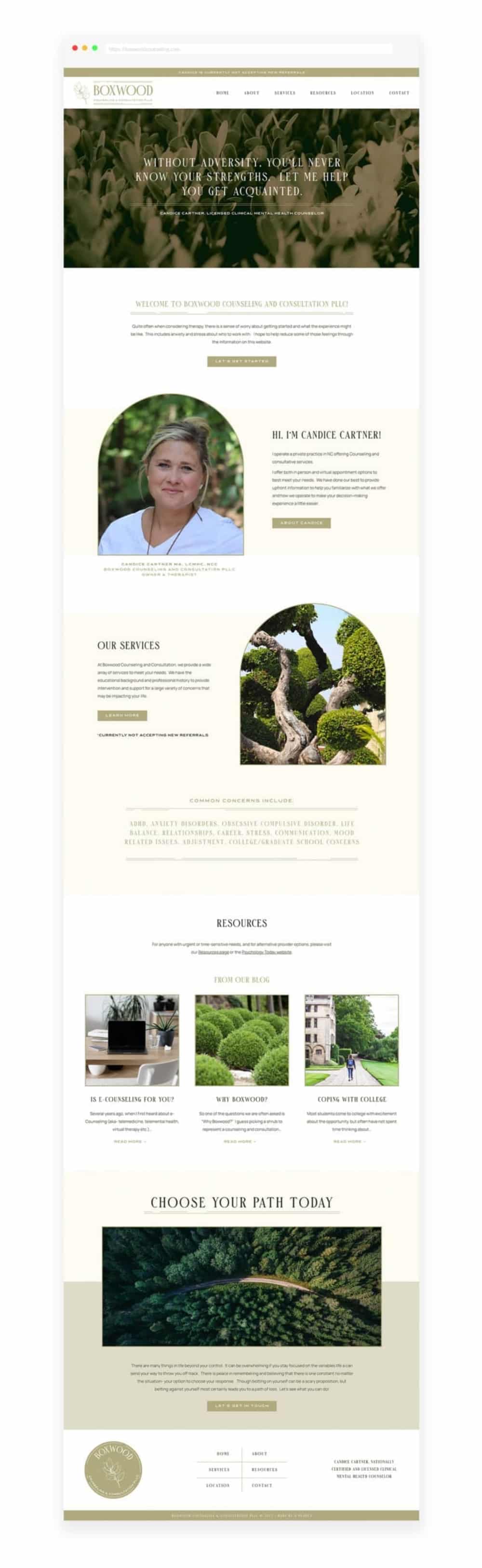

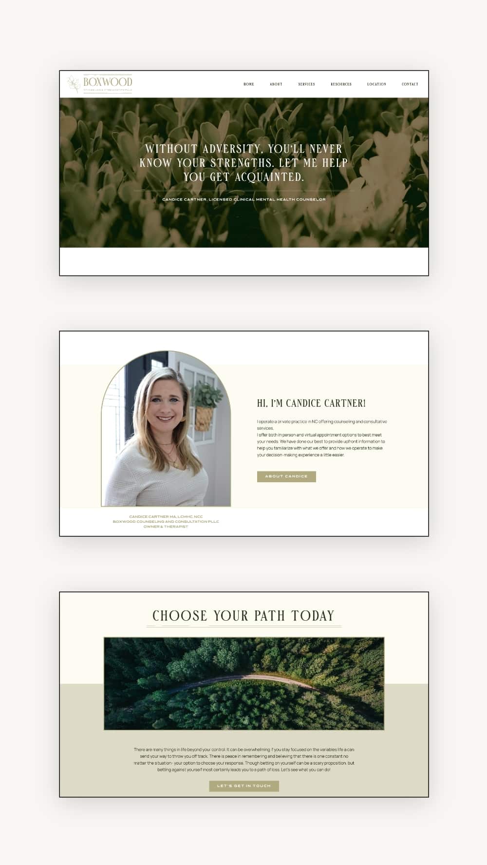
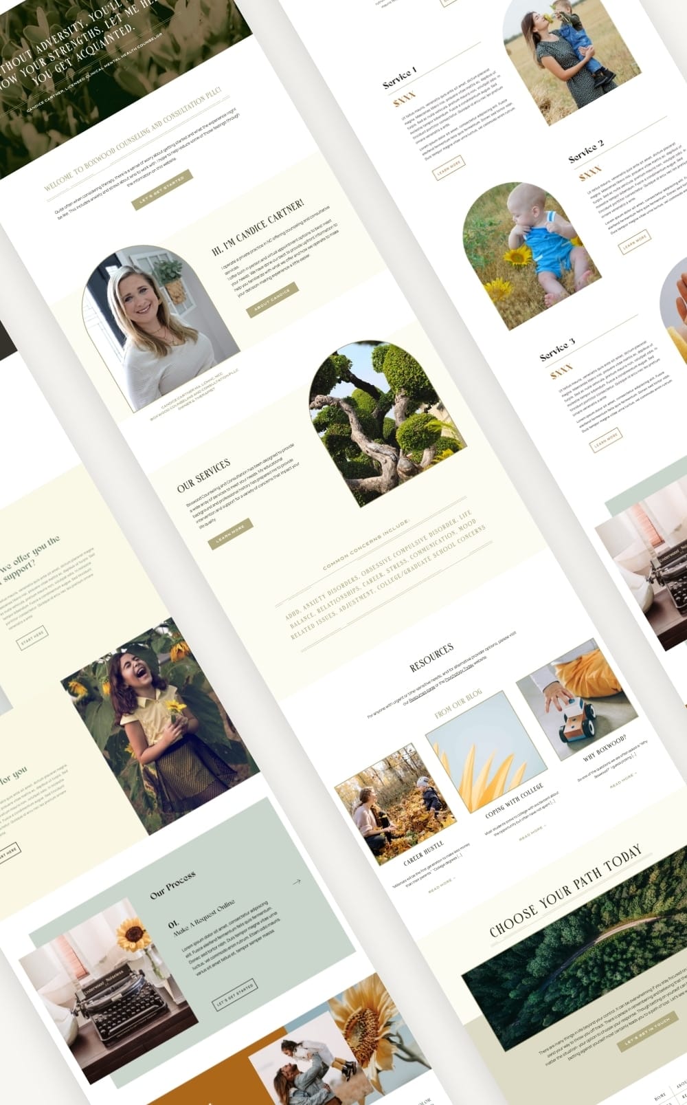
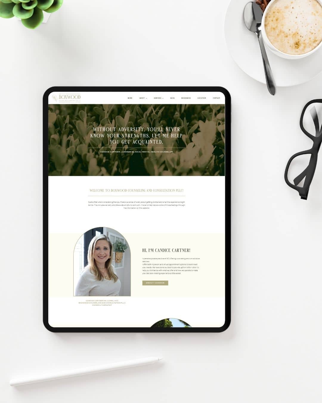
This project is for solo practitioners, therapists, counselors, and licensed mental health professionals who have built a strong reputation on referrals but whose website hasn’t kept pace with the quality of their work. If your site is technically functional but visually dated, if you’re spending time answering questions the website should already be answering, or if you’re manually managing a waitlist because nothing is automated, this is the kind of work we do.
Candice is a Licensed Clinical Mental Health Counselor running a private-pay practice in High Point, NC. She specializes in anxiety disorders, ADHD, life transitions, and outcome-oriented work with ambitious adults. She was so booked out she was about to close new referrals. Her site wasn’t the problem — her site just wasn’t working as hard as she was.
Candice came in with clear goals, and she articulated them better than most clients do.
Her primary goal: help the right person get to yes before they ever reach out. She wanted a site dense enough with real information — credentials, specialty areas, ages served, payment model, pricing, next steps — that a prospective client could make their decision entirely on their own, without a phone call, without an email, without putting anything on her schedule.
Her secondary goal: reduce the volume of pre-appointment contact she was managing manually. She was writing individual responses to everyone on her waitlist because the site had no automated system. She wanted that handled for her.
Her longer-term vision: room to grow. Online courses, digital products, expanded ways to reach people beyond 1:1 sessions. The site needed a foundation that could hold that future without requiring a rebuild.
And she had one aesthetic goal she stated very plainly: “She seems nice, approachable, and like she knows what she’s doing.”
The existing site had genuinely good bones — the information was organized and clients said so. But the visual design hadn’t been touched in years, the logo didn’t work across applications, and the overall experience didn’t reflect the caliber of care being delivered. The gap between how good she was and how good she looked was the problem to solve, not a complete rethink.
The logo had real constraints. As a PLLC, she needed the professional designation on at least one version for licensing and liability reasons — something many designers don’t think to ask about with licensed practitioners. She also needed two functional versions: a badge for formal documents and promotional materials, and a lateral version for headers and digital use. And it needed to work beautifully in a single color.
The brand identity itself was specific and a little paradoxical. She wanted something retro and clean, with “feminine power” but nothing swirly or sorority-adjacent. “I wear makeup and have my hair done but I’ve got on my leather jacket and my motorcycle boots” — that’s the brand.
The waitlist problem needed a real solution. She had no way to toggle availability without manually rewriting the site. She had no automated response for people who reached out when she wasn’t taking clients. She was managing it all by hand, and the volume had grown past what was sustainable.
Everything on this site is built around one insight Candice brought to the table herself: the goal isn’t to impress everyone. It’s to help the right person decide quickly, and make it easy for everyone else to leave without wasting anyone’s time.
That’s a fundamentally different brief than “make it look good.” It means the site has to answer hard questions directly — pricing, availability, who she works with, who she doesn’t. It means the design can’t be warmer than the information deserves. And it means the functionality has to do real work, not just sit there.
The waitlist and availability toggle isn’t a nice-to-have. For a solo practitioner at full capacity, it’s the difference between a site that creates labor and a site that reduces it. The logo works for the same reason. It carries a specific idea she named herself. Boxwood shrubs can be shaped into anything. The plant doesn’t determine the outcome. The work does.
Boxwood Counseling launched April 3, 2023 to a practice that already had more demand than it could serve. The site’s job was never to generate volume — it was to support the right kind of decision at the right moment.
Within months of launch, the contact form was generating consistent weekly submissions. Those numbers held steady and continued into late 2024. For a solo private-pay therapist who specifically designed her intake process around reducing pre-contact noise, a steady stream of qualified form submissions — from people who had already read the site, already self-selected, already decided — is exactly the metric that matters.
The automated waitlist system meant she stopped writing individual replies to people she couldn’t take on yet. The availability toggle meant she could close new referrals without pulling the whole page down. The site did its job so she could do hers.
It is still live. Still working. Still reflecting a practice that has never needed to advertise itself once.
Candice Cartner runs one of those practices where the reputation has gotten so far ahead of the website that it almost doesn’t matter what the site looks like — people find her anyway, through word of mouth, through Psychology Today, through the kind of trust that travels person to person before it ever hits a search bar. She had a waitlist. She was about to close new referrals. She was, by any measure, doing well.
And yet.
The site was dated. The logo didn’t work across applications. The visual experience of arriving at boxwoodcounseling.com didn’t match the experience of actually working with Candice — and she knew it. “It’s old. It needs to be modernized.” That’s how she put it in her intake questionnaire. No drama. Just a clear-eyed acknowledgment that the site was playing catch-up to a reputation it hadn’t earned yet on its own.
She came to our strategy call with more clarity than most clients walk in with. She knew her ideal client. She knew how they found her. She knew what they needed to see before they’d reach out, and she’d been thinking carefully about what happened when they did. At the time, she was manually responding to every person who hit her contact form, writing individual messages because nothing was automated and it felt wrong to do it any other way. “When it’s not automated, I feel more obligated to make it personal. I don’t have time to do that anymore.”
That was the real brief. Not just make it look better. Make it work.
Ingrid led the logo. Candice came in with a concept already formed — she’d referenced boxwood shrubs in the call in a way that told us exactly what she was after. “It doesn’t matter what it looks like when you get it. It doesn’t have anything to do with where it could end up. That’s really about what work you put in and what direction and where you want it to go.” Surviving plant. Any shape. That’s the mark she wanted. Clean, retro, functional in black and white, with a badge version for formal documents and a lateral version for everything else. And PLLC on the badge — because she’s a licensed practitioner and she knows what that means even if most designers don’t think to ask.
The site itself was built around her philosophy, which she’d been living before she ever thought to put it on a website. Answer so many questions upfront that the wrong people leave on their own. Make the right person’s decision easy. Reduce the back-and-forth. She said it plainly: “I want to answer as many questions as I possibly can up front — even if it answers questions that make them choose another therapist.”
We built the waitlist toggle. We set up Fluent Forms with Google Sheets integration and automated responses. We migrated off WP.com to HostGator. We went through Adobe XD prototypes and multiple rounds of Markup.io revisions — photo swaps, copy corrections, pricing updates, layout refinements. She was an engaged reviewer with a clear sense of humor about the process. (“Don’t murder me, but I think we should change a few of the photos of me.”) She took most of her own photos.
The site launched April 3, 2023.
Within months, the contact form was getting consistent weekly submissions. The automated waitlist meant she stopped dreading the inbox. The toggle meant she could close referrals without pulling the page down. The site settled into doing exactly what she’d asked it to do: help the right person find their yes, quietly and completely, before anyone picked up the phone.
It’s still doing that now.
The footer still says “Made by a Peanut.”
Yes, we work with solo practitioners. A one-person private practice needs a site that works harder, not less — because when there’s no team behind it, the website has to be the trust signal on its own. Boxwood is a solo practice and it’s one of the projects we’re most proud of.
Not always — but “functional and outdated” is its own kind of problem. Candice’s site had good information and clients said so. What it couldn’t do was reflect the quality of care behind it. The visual experience was lagging behind her reputation. A private practice website redesign isn’t about
Yes. For solo practitioners especially, this isn’t a nice-to-have — it’s load-bearing functionality. Candice was manually managing a growing backlog of waitlist inquiries because nothing was automated. We built a Fluent Forms waitlist system integrated with Google Sheets, an automated response, and a toggle that let her flip between accepting and not accepting new clients without
Yes. Boxwood was a full brand and website engagement. Ingrid led the logo — a custom mark with a badge version and a lateral version, designed to work in black and white first. When the logo and site are built together, everything speaks the same language from day one. And if you’re a licensed practitioner, we’ll know to ask about PLLC requirements before we get started.
Boxwood ran from intake questionnaire in September 2022 to launch in April 2023 — about seven months, including strategy, logo design, design, development, and multiple revision rounds. Timelines vary by scope and how quickly clients move through feedback. We build in the time it actually takes.